Visual storytelling is a visual narrative that is told or displayed through the use of visual media.
What is visual storytelling?
Visual storytelling is a visual narrative that is told or displayed through the use of visual media. Visual stories may be displayed in different visual formats, including:
Video
Illustration
Photography
These forms of visual media are often complemented with enhanced graphics, music, and forms of audio. Other forms of visual storytelling include:
Collaborate effortlessly, save time and spend less
Why settle for a lackluster social media management tool when you could be using Sked Social? With unlimited collaborator access, streamlined approvals and advanced auto-post technology that lets you schedule to all major platforms, Sked Social offers everything you need.
Humans have relied on visual images for information and guidance since the beginning of our existence, and the same applies today. From cave paintings to watching videos on YouTube, visual storytelling is a powerful way to educate, share ideas, educate and communicate ideas.
Visual storytelling gives individuals and businesses alike the opportunity to display stories, messages, and information to their audiences through visual mediums and make complex stories easier to understand.
In the age of digital marketing, visual storytelling can help you bring in more customers, make more money online, and create relationships with your website visitors.
In this article, we’ll take a look at 15 different examples of visual storytelling to give you some inspiration for your own visual storytelling creations.
15 examples of visual storytelling
#1 Instagram Infographics
Instagram infographics, like this one from Lucas O’Keefe, are a fantastic way to share everything from health tips and eco-friendly facts to the latest brand updates in a format that’s visually appealing and easy to engage with.
Infographics work well as visual storytelling tools on Instagram because they combine visual appeal with concise information, making it easy for audiences to quickly grasp the key points without overwhelming them with text.
A strong image with a strong caption is always a great way to get information across. This famous image showing famous Italian automobile inventor Ferrucio Lamborghini is partnered with a famous quote that inspired him to create the first Lamborghini. The first market that Ferrucio created Lamborghini for was the tractor industry, hence the Lamborghini tractor in the image. This image gives the reader the message that they should be courageous in their goals, and it can inspire those looking and reading it to take action.
This image that Heinz has used on their X (formerly Twitter) feed displays a tasty-looking burger that their sauce can be used upon. Anyone viewing this image is immediately drawn to the food shown in the image. Heinz is clever with this piece of marketing as they post a link to the recipe so anyone seeing the image can click the link and make the burger for themselves, and it’s likely they’ll make the association with Heinz sauce in the future.
This visual representation of the human body lays out steps that anyone can take to cure a hangover. The graphic clearly displays all the signs and symptoms of a hangover and shows what can be done to remedy each symptom. Anyone who views this image can also use it as a reference if they ever find themselves hungover and need some guidance about how to remedy the situation!
This image taken by photographer Javier Arcenillas is part of his exhibition ‘Latidoamerica’, which highlights the social and political violence carried out in Honduras. The image shows a young Maras gang member praying in San Francisco Gotera jail in San Salvador. The image is quite emotional to look at and evokes strong emotions in anyone looking at it.
#6 LawRank
The above graphic from Lawrank, an SEO company for lawyers, is an image from their step-by-step guide to SEO for lawyers. This infographic is extremely useful for those seeking to learn this marketing tactic themselves through an SEO course or even hire it out to a firm like theirs. It gives an overview of Google’s core web vitals, which is an initiative by Google that provides unified guidance for quality signals that are a key part of SEO and are vital to a website providing a great user experience for its visitors. When the reader gets to this part of the guide, this image helps them to visualize what core web vitals look like and along with the text gives them a good understanding of Google’s core web vitals.
This quick 15 minute Yoga routine clearly displays an easy-to-follow Yoga routine that anyone can implement. Just like the hangover example above, anyone viewing this image can use it as a handy reference anytime they want a reminder on different Yoga poses that they can use in their Yoga routines.
In this graphic that maps the past, current, and future state of content marketing, viewers can get a clear sense of how content marketing has changed over time and the trends that will occur in the coming years. When looking at the image, your eye is drawn immediately to the heading ‘The Journey Begins’. Due to the design of the graphic, your eyes are also naturally drawn to move along the different sections and consume the information. Each section is also organized and separated by a different color which keeps the information organized and easy to follow.
Like the 'content diversity' example above, 'the life story of butterflies' graphic catches your eye and walks you through each stage of a butterfly's life cycle. Each section has a different color which clearly separates all of the different information in a clear way. All of the text is also linked with arrows, so anyone viewing the graphic can easily follow the information.
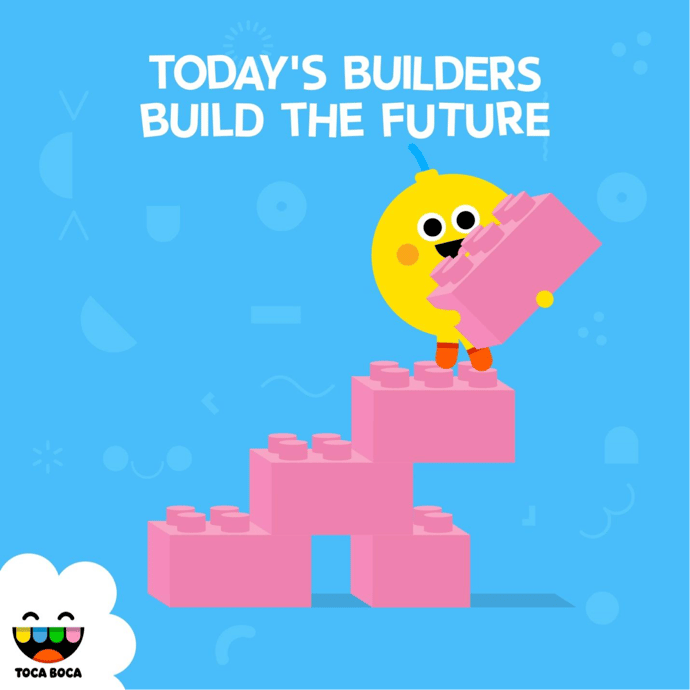
This image showing an advert from Swedish app development studio Toca Boca is a great example of an image bringing to life the text that is on display. Toca Boca specializes in making educational apps for children, and their marketing does a good job of conveying what their brand does and stands for. The images of the blocks and the words ‘today’s builders build the future’ also hint that the people using Toca Boca’s apps (children) will be building the future, and the blocks convey this message.
#11 Email open rates by region
This in-depth breakdown of email metrics by email marketing company Sendinblue is an interesting graphic for every marketer to look at. Anyone seeing the graphic can clearly understand the average email performance rate by region and compare this with their open email metrics based on region. Interestingly email open rates in APAC have the best open rates but also the highest bounce rates.
Marketers can use this data to make comparisons with how their own digital marketing channels and email marketing campaigns are performing.
This graphic shows the different types of pie that Americans enjoy on thanksgiving. This graphic is an excellent example of using visual media to show information in an organized manner. It's informative as it tells us what Americans' favorite type of pie is, and it's also entertaining as the information is displayed in a 'pie' chart. Like many of the examples we've shown, this image could easily work as a reference for people interested in the information shown in the graphic; the image would also work well in a topical blog post.
This image from Poppin Desks is a great piece of visual marketing as it displays its products in a vibrant way. It also shows how someone can keep all of their paperwork, stationery and office equipment organized. The image is also very colorful, making it easy on the eye and easy to differentiate between the different pieces of equipment.
This image from Camp Brand Goods displays their products perfectly. Whenever someone goes to buy camping products, they do so, imagining themselves using the products in locations and on adventures such as the one displayed in the image. Camp Brand Goods use this image on their Instagram feed with relevant hashtags. These types of images draw the eye, engage their followers, and show exactly how their camping products can be used.
Post-covid and with the rise of working from home,companies have to work harder to attract talent and show that their company is a place employees get peer recognition and where talented individuals will want to work. This image does a great job of displaying a fun and happy company culture. It also gives this company a human feel. A lot of brands hide behind corporate images and language, particularly on their website; doing this can make it seem uninviting for potential employees when a company is looking for new talent. Images such as this also work well on social media and can be a great way for a brand to gain new followers.
Conclusion
These visual storytelling examples should have given you some ideas of how you can represent data, information, and stories in a visually appealing way. Presenting messages, information, and data in a way that’s easy for you and your audience to understand and make conclusions from will always be more powerful than presenting data in a way that’s difficult to interpret and understand.
Our content is always evolving, just like the world of social media. This post was recently updated to ensure it aligns with today's social media landscape.
Try Sked Social free for 7 days!
Sked's tools are designed to streamline your workflow, enhance team collaboration, and deliver exceptional results for you and your team.
Our blog, Instagram Trends & Memes, is your one-stop shop for all the latest buzz on the platform. Sign up below to receive regular updates straight to your mailbox.
What to read next
Local support, local pricing—no currency shock or timezone battle


